top of page


TIC TAC
Radiating Positivity
Vision: Good vibes only.
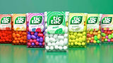
As a well-established classic, the Tic Tac brand needed rejuvenation. To refresh a brand known for freshness, we needed to reconnect Tic Tac to its carefree spirit.
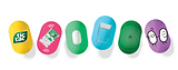
At the center of the refresh was the 360° activation of the one and only Tic Tac pill shape. Across packaging design and branding, we elevated the classic pill into cheerful rays vibrating with an energizing minty chill.
Heart: Rays of positivity.
Our Toolbox
Strategy I Tone of Voice I Branding I Packaging I Global Deployment


DISCOVER MORE
bottom of page